I wan na make money off this. I wan na sell a digital ebook. How do I do that? Yeah? That’s! Actually what We’re going to cover today How to actually make Money with your website by creating a landing Page here on The Journey So right now all I have is a blog. I mean what else do I need Yeah so to really actually Convert those visitors into leads which then becomes customers.
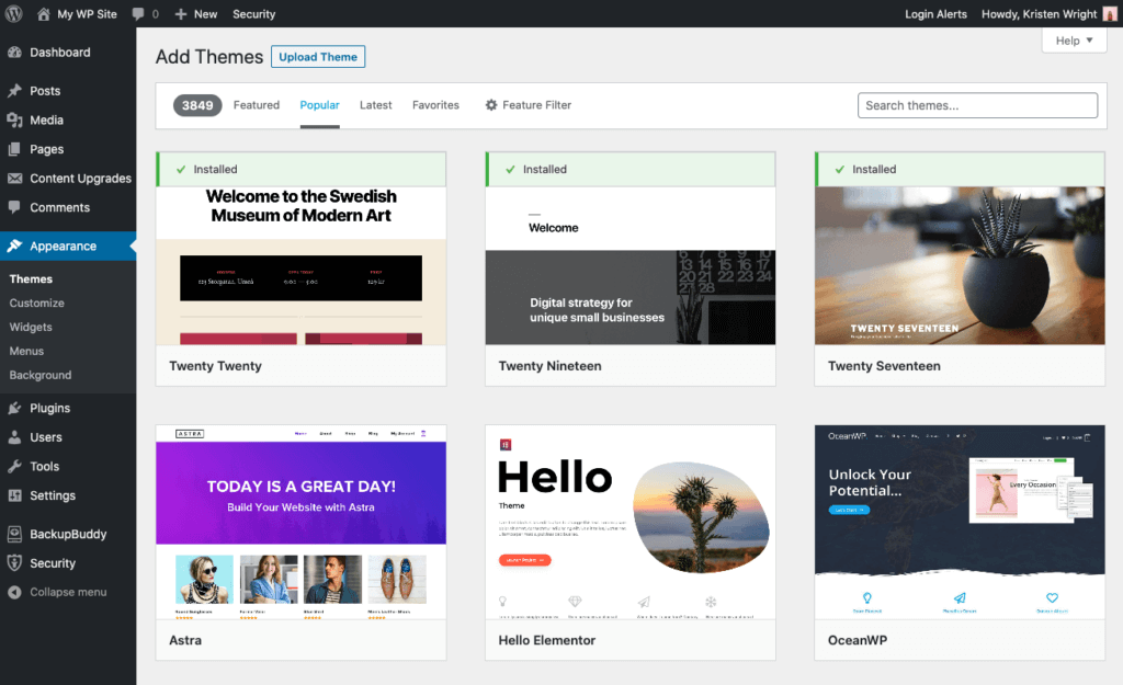
You have to create a landing page. A landing page is a specific Webpage on your site catered to one specific purpose. Now, what I’ll see a lot? Of people do is like say, you’re starting to Advertise your book most people will just send People to their homepage, There is so much chaos. Going on a homepage, there’s no clear: Direction, they don’t know where to go So with your landing page. You have one clear focus on your website and that’s To check out your ebook So you’re, the real Expert at this I mean: can you just show me how it’s done Yeah, let’s go ahead and Take you and the audience through a quick demo, Alright, so now that we’re sat down I’ll, take you through some of the plugins that I use to really Build those landing pages and get set up for success.
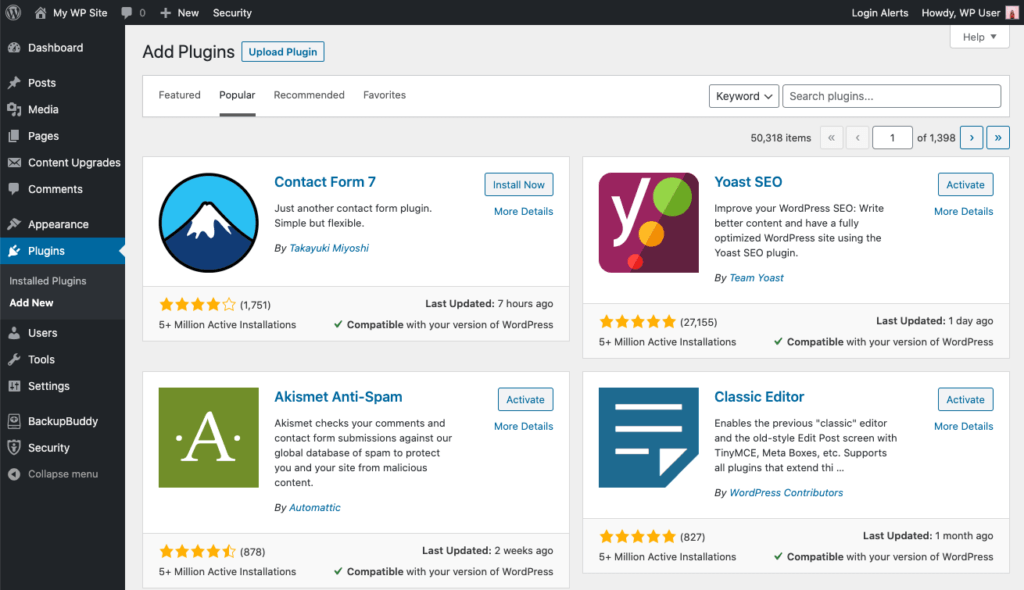
I did that before hand. So We didn’t have to go through the whole installation process, But I’m going to be using Elementor essential add-ons for Elementor and Gravity Forms There, the ones that are just There cause I like them So once you have those You’re going to ahead and just add a new page Cause – you want this Landing page to just be that just a landing page, specific To what you’re trying to do So, you talked about how you’re wanting to create your own ebook right Right.
So what kind of recipes Are going to be in those ebooks? I was thinking like taco recipes start with that one: Okay, a little taco Tuesday night Love tacos, of course, [ Nealey ]. I got it so we’ll just name it Taco Tuesday recipes And then we’re just going to Go ahead and publish that really quick and then Jump into Elementor, So Elementor is a visual Page builder, that you can use to build almost any type of website, so drap and drop – it’s all visual.
So we have this here Now what I usually Recommend for landing pages is actually to get rid. Of the navigation title, Its distracting [ Alex ], Okay, [ Nealey ], The whole Point of the landing page is to have one singular focus like you want these people Visiting your website visiting your landing page To do one specific thing: [ Alex ] Right as simple as possible: [ Nealey, ] Yeah. So in Elementor the bottom left go ahead.
And just chose the little settings wheel and go page Layout Elementor canvas, and it’s literally just going to be that a blank canvas for you. To do whatever you want So you’ve also got me. Some cool taco images we’re going to use a lot of that in this in this page here. So the cool thing about Elementor, especially for someone who brand new to building websites, is it Gives you some templates to use you don’t have to figure Out how to design yourself [ Alex ] Love templates, Highly recommended You don’t wan na spend all day just trying to Figure out how to design it just basic plug and play.
I really like the block. Section it’s kinda like Legos in a way right: [ Alex ], Okay, [ Nealey ], So you have like You can pick different categories like a hero. Image or call-to-action different things like that, Basically build your landing page, So we’re going to go! Category just chose hero Hero is basically that first thing you see when you get to a website. It’s usually nice and big and out there There’s lots of different Things you can use Now it’s going to show you Content that is not relevant to tacos at all, And that’s fine.
You can change it with your own images. [ Alex ], Okay, [ Nealey ], So which one Would you like to use [ Alex ]? I like this realism, one [ Nealey ], The realism. One that one says pro got ta have the pro license: [ Alex ], Okay, never mind. ( laughter, ) [ Alex ]: Let’s go with the cheaper option: [ Nealey ]. Alright, how about this one [ Alex ], Perfect [, Nealey, ], Cool [, Alex ], Looks nice and free [, Nealey ], We’ll make it like that one It’ll be like we did.
( laughing ) [ Nealey ], Alright, so obviously we don’t want 17 travel inventions. We need right now we’re Going to change that in a sec but instead of a plant Let’s make it your tacos,’cause, that is the pride and joy here Wan na make it all about your tacos,’cause. I’ve had them And they are fantastic, Alright cool, so you can either click this little guy at the top or right click edit section go to style, and then you can chose your image here.
[ Alex ] We’ve got some Great images of these tacos and their recipes [ Nealey ] Yeah, so which One would you like to use [ Alex ], Let’s go with the One with the lime showing [ Nealey ]. Alright, I dig it. I dig it. Ah man, it looks so good [ Alex ]. I know I’m so hungry Neal, [, Nealey, ], So a cool effect. You can do in Elementor is just have that fixed I really like to use that, especially with hero images, so that stays still as the content loads.
I probably want this bottom-center. Ah, look at that: [ Alex ], Perfect [, Nealey ], I’m hungry, Alright, so the call-to-action this on the hero image has To be very, very specific, so that first little bit is Really what you’re going to get out of the landing page, So, let’s brainstorm some ideas. So with this you really want it to be. What is what is your Visitor, what is that person going to get out of your recipe book? So I mean taco recipes.
To make your Tuesday better, Okay, taco recipes to Make your Tuesday better! I like it. I don’t need this travel thing, so I’m just going to right. Click and delete there Now you can add a little Bit of a description here, if you want, I typically recommend it We’re going to leave the Description out of it for now we don’t want to get too much into this really just about you learning how to make your landing page, But this button right, Here this call-to-action is super important, Not enough websites.
Basically tell the visitor exactly what to do Like you literally want To like yell it at them, do this now [ Alex ] Right and make it very clear, [ Nealey ]! So with this It’d be like “, buy, now” or “ download the book” things like that Specific action to do Download the book. If I can type Now cool And you can modify the Button, however, you want by going to just right click, the button go to style, and then you Can mess with the colors? What’s your favorite color [ Alex ], Let’s go with green [, Nealey ] Green, all right! Green is the color of money.
I dig it All right and then you Can mess with the hover? Obviously we don’t want green on green. That doesn’t make sense. And then there’s all sorts of cool hover, animations Let’s do grow and rotate so it does this cool little effect. [ Alex ], Oh fancy, [ Nealey ], Just like that, And let’s move on All right. So I threw this Together, really quick off camera, just for the sake of time, We talked you through Some of the most important elements for your landing page.
We went through our hero image already having that basic description. Of what they’re going to get out of it? A quick call-to-action, But the next part that I like To include in landing pages is really relating to The person’s problem – So I put here, are You struggling to find the perfect taco recipe, [ Alex ], Of course, [ Nealey ]. These people Have scoured the internet trying to find that perfect taco recipe they haven’t, found it until now, [ Alex ].
I have the answer: [ Nealey ], Then after you really relate to that person’s struggle. Talk About what they’re going to get out of it like right? Like they’re, not just getting a book, they’re Getting 15 taco recipes they’re getting article tutorials they’re, getting a happier Tuesday You’re, also including Coupons for ingredients, look at you you’re, so nice [ Alex ]. I know I know You’re welcome guys [ Nealey ] And then with The landing page as well add some time of social proof.
These are reviews whether on websites or people. Looking at it, I’ve added some reviews. From myself, Morgan and Sam talking about the best Tacos we’ve ever had Morgan’s like I want More recipes like this Sam’s, like hands-down Super hot fire recipes [ Alex ] Straight from The source you guys [ Nealey ] Straight from The source and then last but not least, your Main call-to-action towards the bottom.
Now with you just getting started, we just have a subscribe. Now to get your copy and then click subscribe for you at home if you’re Trying to sell something – this is a great portion. To put where basically you’re selling something [ Alex, ], Okay, [, Nealey, ] And what’s cool about this – is with Elementor. You can add. What’s called an anchor link, so this download the book Now say: we’ll do a CTA for the link can link to this.
So when someone clicks it Like cool download book now, they just go all the way down. And they can subscribe now to get the copy [ Alex ] Nice and easy [ Nealey ]. But with these landing pages it can be literally anywhere You’re directing people, whether it’s on social media, You have basically a post talking about this cool stuff, instead of sending them to the website. Your homepage, where It’s super distracting, send them to a landing page Same thing with Instagram Or maybe Google ads or Facebook ads or maybe Just talking to somebody, you have a clear direction: Of where to send them When they go there, they’re like cool, I only have one thing that I can do on this site and it’s to get your taco recipes Got ta, make it as easy as Possible for your customers Right, we get distracted.
I know I do all the time Yeah. You got about two seconds. If that, Let us know in the comments below what your favorite part of My new landing page was Yeah and I hope this Gets you super excited to start making your own landing pages like I said I used Elementor, but you can use whatever Page builder, you want to use, but while you’re adding those comments, if you got some value out of this article, make sure you like this article and subscribe to our blog, so you can get this content first.
I have a fantastic tutorial, I’m going to be showing you how I created this landing page. In fact, let me show you what it looks like okay, so this is the landing page. As you can see, we have a nice beautiful image here. We also have some text the heading and the subheading and a call to action button on the bottom. Here we have a section which has the most requested recipes.
I’r going to show you how to create this and then finally, on the bottom here, we’ve created this page, where it showcases who the chef is. So this is where your image would go and then on the top here we also have maybe a name, a description and also a article now this article here as it has an overlay image. So I’m going to show you how to do that and then, finally, over here we have these social media icons, so this can link to your social media profiles.
So this is what we’ll be creating today. So I don’t want to be using Divi to create this. So if you want to by DV or use DV for your web design processes, I highly recommend it, and I have something fantastic for you. If you buy Divi using my affiliate link, I will give you access to my full Divi blueprint 3 course. This is a course which teaches you everything that you need to know about designing websites using Divi.
It’s a complete course. You will get it absolutely free. If you use my affiliate link, which I’ve added in the show notes below. Okay, let’s get started. Let me show you how I managed to create this page. So, first of all, before we begin, I want to talk about the images. So what makes your website look really really awesome and professional he’s using high-res images so online. There are few resources where you can go to and download all your images absolutely free.
So you can use these images for your personal or commercial project, so one of the websites is pixabay. Another one is called pixels comm. I will also leave a link to those websites in the show notes below ok. So this is the website I go to so in this project. What I did is, I came over here and I just searched for food okay, so you can go through this and see what type of images you want to use for you project, but this is the best place to come.
So if you click here on this image, you’ll notice that you’ll have this green button which says free download. So when you click on it, it also shows you the sizes. So what you do want to do is to choose the highest size here. It’s really unnecessary. So, nineteen, twenty by twelve, seventy that will work really fine for our large images. If you’re going to use smaller images on your website, you can just download the appropriate size, and this is very, very important, because if you choose the high res images, it’s going to make your website really really slow.
So once you download these, you can always add them onto your website. Okay, so the next stage now is: let’s go ahead and start building our page. So I’m going to come over here to my admin dashboard, so I already have Divi installed. So I’m going to go ahead and build my pages, so I’m going to come over here. Click on add new page, and I’m also going to give my page a name. So I’m going to call this: what can we call it? Let’s call it Mac food.
Okay! Next, I’m going to click on use, Divi builder, so now we’re going to have three options. We are either going to clone an existing page, choose a premade layout and build from scratch. So because I want to show you step-by-step how to build this page from scratch. I want to show you that process so we’re going to start to build this page from scratch. I’r going to click here on builds from scratch and then the first thing I’m going to do is to add two columns: go ahead and click to my two columns here and then over here on the Left column.
The first thing, we’re going to add, is a text module. This is where our heading is going to go. So I’m going to search for my module here there we go, the text module, I’m going to select it, and then this is where our headings going to go. So I’m going to delete most of this text here and then I’m going to come over here to in fact I’m going to highlight all this text and then click on this drop down where it says paragraph, because we need to choose heading 1, because this is Going to be our main heading, ok, so what you can do also here is: you can use lorem text if you don’t want to use the default text that comes with it, because this can also give you an idea of how this is going to look.
So I’m just going to copy my lorem text over here and I’m just going to paste it and replace and my text over here. Okay, so making sure it’s set to heading 1, we’re going to come over here to design and then I’m going to go to heading text. So you can see here. Heading 1 is selected. So now I’m going to choose the font that I’m going to go with for this design and in this case I’m going to go with Poppins we’re going to make it nice and bold here.
So I’m going to go for ultra bold and then we’re going to boost up the size. Okay, so you want it. Nice and big, so I’ll, say about 52, looks great. Okay, I’m happy with that. Let’s go ahead and save this okay and then we’re going to come over here highlight this area here this time, you’re going to add a description paragraph, so we’re going to click this plus button. So for the description paragraph, it’s going to be a text module.
So I’m going to search for it again, one more time select it come over here Lauren, and this is going to be my description text, so I’m just going to copy it here like that, then I’m going to overwrite this like that, so this is fine. This is description text, so it can just go in as it is like this now we’re going to come over here to design text and we’re going to make this slightly bigger. Let’s make it about 19 we’re going to change our font here to pop-ins and by the way these fonts are google fonts.
So you can just go ahead and use them by just searching over here. Okay, alright! So now that I have this now, just looking at that, I can see my lines are way too close together. So what I want to do is to just give them some breathing space. So to do that, you want to come over here to text line height. Okay, so set it to 1.8, and now you can see it’s much easy to read. Okay great over here. In fact, the size looks okay, that’s fine! I’r going to go ahead and save okay, so the next stage now is to add our background image.
Okay, that image that makes everything look really really awesome. So I’m going to come over here to this section. Settings click here on this gear, icon click on background and then I’m going to go on the third tab. Okay, so this is where I’m going to click. This plus button and choose my image, so I’ve already got my image here in my media library. In your case, if you don’t have your image in the media library, you want to come over here to upload files.
Okay, so once you click upload files, in fact, let me show you what it looks like if you click on select files. This is going to take you to wherever you’ve downloaded all your images and then this is where you can just come and click the click. The image and then upload it okay. So, as I mentioned, I have all my images in the media library. So I’m going to click here on my main image and you can see here, the size is 1920 by 12.
28. That’s look! That’s perfect! Click upload! An image: okay, now our images in the background, but you know what we have a problem. We can’t read this text on this background, so this is where we want to add our gradient, which separates the text from our image. Okay, so the first thing I want to do here is to come over here to design spacing and I’m going to add some padding. First, so don’t add 10 % okay, because you want to give this some breathing space.
We want to really show the food on that hero area. Okay, so now that I’ve added this, I’m really happy with that. I’r just going to save this for now, because I want to go ahead and add my call-to-action button, so I’m going to click this plus button, and then I want to search for button. Okay, go ahead with that select my button, so by default. This button comes here, it’s really boring. It doesn’t really look exciting, so we can actually go in and make some changes to this so to make some changes to this we’re just going to.
In fact, let’s just give this a title of download recipes here: okay, download recipes, yeah. Okay, so let’s say that’s going to be our call to action. Okay, so over here is where you add your link. So this is where you want to direct people to the download page where they can download that recipe. But this call to action can be anything okay, it can be click here to get in touch with us or whatever it is, and then that can link to the contact page all right, so we’re going to keep things simple here, I’m just going to add a Blank link next I’m going to come over here to design so over here, I’m going to click on button, so this is very important to make changes to your button.
You want to make sure you, click on use, custom stands for button and then over here on the text, color we’re going to make it white and then for the background, color we’re going to start giving it. Let’s give it a read. Okay, I really like that red because it’s it’s an appetizing color. It goes with food and it also goes with some of the shades of food that we have here in the hero area. Okay, so the next stage here is to add a border.
So again, I’m going to add my border, make it red and then the next stage is to customize our text. So I’m going to scroll down further down here make sure my font is set to poppins just to keep everything consistent. I can also make this all caps if I want to, in fact, I think that looks better and then for the weight I’m going to keep it at medium. Let’s see what it looks like on semi bold, if I leave it at semi gold, so that is looking great now over here.
You can actually change your your button on hover, so you can see now it’s an arrow. So it’s up to you! If you want to use something different, okay, so now that we have our call to action button, everything looks really really good. So now I’m going to go ahead and save so. The next stage now is to really add a gradient which is going to separate our text from our image background. So we want our text to be able to to be easy to read.
So what I’m going to do is to go back over here into my section settings click on background and then I’m going to click the second tab now this tab here is the gradient. Tab click this plus button and I’m going to add my first color and my first color here is going to be black okay over here. I’r going to add my second color, I’m going to make it black as well, and then I’m going to come over here to place gradient above background image.
Okay. So, if I do this everything’s going to go really dark black and you’ll be like wow, what’s happening over there right anyway. What what is happening here is we’ve placed our gradient above, but we’re going to add some transparency so that we can start seeing the image in the background. Okay. So let’s start by adding it on the second color over here. So I’m going to drag this slider down like that and, as you can see now, it’s starting to show so keep going, keep going.
I think I’ll stop right there at zero point. Zero point: zero point: thirty nine! Then over here! This is where we want to play with our gradient direction, so I’m just going to flip it round. Here, let’s see one twenty two, so I want to try seventy-three, okay, that looks that doesn’t look too bad and then over here I’m going to play around with my end position, because I don’t want it to go all the way and cover all the beautiful image That we have in the background, okay and also a start position here.
I can just increase that a little bit like that, and then I’m also going to adjust my angle here. So I think I’m pretty happy with eighty degrees. Okay, so, as you can see here over here on the on the Left, it’s really really really dark, so we may not want it really dark like that. Our main, our main aim here, is just to let our text much easier to read, so I’m going to click here on this on this first color here this black and add some transparency to it.
So I’m going to drag this down just a little bit. Okay, I think this is fine. Okay, I’m going to go with that 87. So now we have a gradient over here where we have our text. So the next stage now is to go in and change the color of our text. So I’m going to click here on this gear icon to go into my text: settings click on design, heading text and then we’re going to change this to white okay. So now you can see it really stands out right.
I’r going to save that come over here to my description text. Do the same thing: click here on the module settings; click on design text; we’re going to change this to white, and now things are much easier to read. Okay, so let’s save that the final thing I’m going to do now is to go into our section into our row: settings okay! So I’m going to click here on row, settings design, sizing so over here on the custom width.
I prefer to have my custom width at 70 % that just stretches it a bit more, taking up a bit more space on my hero area, okay, so I’m going to change this unit to percentage and then I’m going to enter 70 % okay. So that’s looking great I’m going to go ahead now and save so pretty much. That’s it okay. So our hero area is done now, it’s time to move on to the next part, which is the second section of where we’re going to add some images where people can click on.
You know the most exciting recipes. Ok, so let’s add our section. So I’m going to click this plus button, I’m going to click here on a regular section and because we’re going to add a title here, we just need one column. So let’s go ahead and add that and in that column we’re going to need a text module. I’r going to search for it and select it click on tanks and then over here we’re going to add a title and our title is going to be most requested recipes.
So we want people to see most requested recipes from our website. But again you know you can use this techniques to add any form of content on that area. The most important thing here is just to take a look at the steps that I’m taking to design this page. So these are the steps that you, you know you need to take designing any type of page all right. So now that I have this in place again we’re going to set this to heading 2, so I’m going to come over here, set this to heading 2.
Okay, that’s looking great I’m going to come over here to design heading text, click on heading 2 and then we’re going to change our font here to poppins, but this time we are going to set this to light. Okay, that looks much better. I change the color to red we’re going to Center this, so I’m going to come over here to your heading 2 text alignment center. That okay and let’s see what happens, if you make it all caps, mmm! Alright, let’s go with all caps, alright and then over here on the letter to heading 2 letter spacing we’re just going to add some letter spacing there increase the size a little bit that so I think 32 is better okay, so we’re going to go with 32.
So I’m pretty much happy with that. I’r going to go ahead and save the next thing. We’re going to add here is a divider, so come over here. Search for my divider select it now we need to customize this divider. So if you want to go with them with a line that goes across, you know it’s up to you, but I want to show you how to actually make it smaller, so we’re going to come over here to design color.
So we can start here by adding a color. So let’s say you want to go for a darker red. You know going to go with that click on styles, so over here it’s on solid, that’s great! So now we’re going to go to sizing so on the weight here we can increase it to about three and let’s reduce the height okay cuz. You want to hide too much and then the width is what determines how long this line is. So we’re going to come down to about 16 % and center it okay.
So that is how you add your divider line right. So the next thing we’re going to do now is to just save this, and then we are going to add another row. But this time we’re going to have some columns in there, so I’m going to click this plus button and we’re going to have four columns right. So in each column we can have a blurb. So I’m just going to search for a blurb I wan na select it. So what we’re going to do here is going to get rid of all this text right because we’re not going to need that and then for the title here.
Let’s call this recipe, one. Okay, so this see this is the title of the recipe, so we can just give it a name. In fact, you know what to make this even more exciting. Let’s just give this a name. You know something that just looks like a name. Okay, so I’m going to pop it for my lorem text there and add my name like that: okay, so the next thing we need to do is to Center it. So I’m going to come over here to design title text Center it and let’s go ahead and customize it.
So, first of all we’re going to change our font here to Poppins we’re going to make it bold. Let’s change the color! Okay! I really like that. Okay, now back over here to the contents. Now, let’s add our image, so I’m going to click here on image and icon click on this area here so now, let’s add our images. So I’m going to go with my first one here, so I’m going to go with what I want to go with.
Okay, let’s go with this crab. Okay, pic upload an image. Now my image has been added great, so I’m going to go ahead and save now. The most important thing now is to go in and copy this design that we’ve just done all these or this image that we’ve just done, because it saves us a lot of time to go in each and every image change the fonts change the size across all The four images, so the quickest way, is to just duplicate these three times and then drag it into the right column like that.
Okay, great. So now that we’ve done that all we have to do now is to go into each and every image and then he’s changing okay. So I’m going to come over here to image an icon click on this area. Here change my image: upload, save that come over here to the next one: click on this gear, icon, image, an icon, click in this area here and add the next one upload an image. So you can see here it’s really really fast.
So I’m going to click on the last one here image, an icon, then I’m going to add this one here. So these are the three I mean the four recipes great, so let me go ahead and save, and then the next thing I want to do now is to come over here to my section settings now remember on our on the top. Here we set it to 70 %, so we really want to keep that consistency, so we’re going to go ahead and add 70 % there.
So we’re going to come over here to background no, we need to go to design sizing, use, custom width and we’re going to set this to unit to percentage and then we’re going to set this to 70 %. Okay, that’s looking great! Let’s go ahead and save now. The final thing is we can see here. The names are all the same, so I’m going to come to lorem too, and I’m just going to copy some text here and just go in so this time.
I’r doing what is known as inline editing, so I can actually go in and paste over the text that I need to add in there. Okay, let’s go with another name here, so I’m just pretending! These are the names of the recipes. Okay. So again, I’m going to click here, highlight this text paste and then finally, let’s go with something that looks like a name here: copy that come over here. Click on this area paste great! So now this is looking like a proper recipe.
Now you know what as I’m looking at the top here, this doesn’t look right, so I’m just going to go back in and make some changes to this okay. So I’m going to come over here to design heading text. I know this is heading 2. So what I’m going to do is instead of adding letter, spacing I’m going to actually get rid of it and then make the text slightly bigger. So I’m going to go with 40 here, okay and for the letter spacing I’m going to try and bring the text even closer.
Okay, let’s try minus one: okay, that’s much better! Okay, so I think that looks yeah much better, all right, so that the text as well, I mean the color, I’m going to make it a bit darker as well cuz. We could too much red here. Okay, that looks much better imma go ahead and save now. Now that I have this section is looking really really nice. The next stage is to add the page where the chef goes and also the description and the article okay.
So I’m going to come over here. Click this plus button I’m going to click on regular and we’re going to need two columns here. So I’m going to go ahead and choose my two columns so in the first column we’re going to add an image when I select it and then I’m just going to look for my image, which is right here, upload an image okay. So now I have my image here of the chef. That’s looking great I’m going to save the next stage while we, while we add it, I’m going to click here on this gear outcome for my row settings again, I’m going to set my sizing custom width to 70 % okay.
So I’m going to change this unit to seventies percentage and set it to 70, so this now just makes everything. All you know, in the same sort of with my constituent, is all going to be the same right so now that we have this in place. The next stage here is to add the text where the name is going to go. So I’m going to click here on texts for my text settings I’m going to come over here. Look for something that looks like a name, let’s see, okay, so let’s go with that and we soon pretend that this is going to be.
The name of our chef highlight that delete all that and paste my text here. Let’s give this a capital letter V. Okay, so I’m going to highlight all this and give it a heading one and then I’m going to come over here to design text. So we aren’t heading one, so let’s go to poppins and let’s make this nice and big, so we’re going to go with 40. I think for this: let’s try and make this light yeah. I think that looks okay and then for the color.
We’re going to go with a dark red, so I’m just going to select this red first and then drag this down. Okay, we’re going to go with that and then we’re going to save next we’re going to add another text module. So I’m going to click this plus button text select that I’m going to go to lorem, I’m going to copy some text from here come back over here and paste. My text like that now, in your case, you want to be adding the text.
That’s going to go along with your website so that your website description. This is where you want to type in your actual text for your website. So the reason why I’m just using this lorem to text is just to save me from typing, because that would have made this tutorial way way way way longer. So this is a good way of just putting some dummy text. So in fact, I’m going to be sharing this layout, so you can actually use this and replace the text with your text.
Alright, so I’ve got this in place. The next thing I’m going to do now is come over here to design text choose our font here. I’r going to choose Poppins and make it slightly bigger. Okay, I’m going to go with 18 we’re going to give you some line height like that, so it’s not easier to read. Okay, so that’s looking great. The next thing I’m going to do now is to just come over here to sizing. No, in fact, we need to go to spacing so this gap here between the name and the paragraph is a bit too much.
So we want to reduce that so we’re going to go the opposite direction. Minus 22 looks great right, so the text also the color – has changed the color we’re going to go with a really dark, reddish color here, Matt. Okay, that’s looking good! I’r really happy with that. I’r going to go ahead and save all right. The next stage now is to add our article. So I’m going to click this plus button and our article module I’m going to go ahead and choose article now.
Here’s the thing, if you want to add your own article, because this is the default article that comes in as a placeholder. So if you want to add your own article, you click here on this gear. Icon insert URL, and this is where you paste your URL from YouTube or whatever your article is. It may be Vimeo as well. Okay, so I’m not going to do that. I’r just going to come over here now, and this is the most important part you see when your article comes from YouTube like this.
The thumbnail that comes with it doesn’t really look nice because it’s got text on top of it. It’s not high-res, so DV now allows you to add an overlay image. So if you come over here to overlay click this plus button, we can actually choose an image to go with that. So let’s say we want to go with this one here or let’s go with this one right here, upload an image. So you see now it has a thumbnail which is high-res, and you also have this beautiful overlay color, and you also have this play button.
So this is really really nice. I really like what Divi has done here to add our images. Okay, great, so I’m pretty much happy with that. I’r going to go ahead and save now. Let’s move on to the next step, and this time we are going to add our social media icons. So, let’s add our social media icons, so I’m going to come over here. Click, this plus button to add our social media module click here on social media follow, so you can see here by default.
We have these two. We have Twitter and Facebook so over here we can add some more by just clicking this plus button and just clicking on this drop down and then choosing you know the one we need so I’ve just added Instagram and what you may also want to do here Is to add the URL to your Instagram account. This is very important. You want to add it over here, okay and then I’m just going to click this little arrow to go back click this plus button and going to add another one: okay so which one can this be? Pinterest is a good one.
Okay, so I think 4 will do for now, I’m going to go ahead and save so. Those are our social media icons right so now, let’s add another design here, so the design is going to go on the the section. So I’m going to click here on my section settings click on background and then I’m going to click over here on this gradient. So what we’re going to do here is we’re going to add two colors and add a design elements to the back.
I’r into the background of our design, so my first color here is going to be a very light grey. Okay, so I’m going to go with that and then our second color here is going to be this red. So by default it gives you a very smooth gradient. So that’s not what we want here. So what I’m going to do is I’m going to play around here with my direction and my end in that position. So I’m just going to drag this over here like that.
Okay, so let’s go to our start position. In fact, let’s add our end position, so our end position here can be set to zero. This is how we get this hard edge line over here, which I think is really cool right. So now we can play around with the angle okay, so the angle can be like that it can be even the opposite direction, so we can have it this way. In fact, this is how I had it in our demo right, so the start position now you can always drag this.
I know to a position which you are really you know happy with. So there’s a lot of flexibility here, so you can always drag it to every one. So let’s say fifty fifty-one percent: let’s go with fifty two okay, so that’s our design there for our section and then the direction here we can also play around with that. Until we are happy with the direction so I’m going to go with 130, let’s see I’ll go with 135, so I’m pretty.
You know happy with that angle that we have here in the background, so this is also going to serve as a design element. Okay, so now I can go ahead and save, and this is how we’ve created this beautiful section design on our page, okay, so pretty much. This is how we create an awesome-looking landing page, just using Divi. As you can see here, the steps were quite straightforward to follow, so I I highly recommend that you go in practice and play around with these settings and also use your own images to design this landing page.
So pretty much, that’s all I have for you. If you have any questions, please ask me all your questions and, as I mentioned, if you buy Divi using my affiliate link, I will give you access to my course so, but the affiliate link will be in the show notes below or in the article description. So all you have to do is to buy Divi using that and then once you’ve done, that you need to send me an email or a message on Mac University dot-com on the bottom right.
There’s a support button. There just send me a message saying: you’ve bought the you’ve bought Divi using my affiliate link, then I’ll give you access to my full course, which teaches you everything that you need to know if you’re a beginner. So this course has everything that you need to know. We design a full working website in that course, so you can go ahead and check it out, alright guys. Thank you very much.
I hope you enjoyed this article, so I hope to see you know your design. So please share your designs after you’ve learned. You know this information on this page I’ll be coming up with even more designs on how to create beautiful landing pages. Take care for now and see you soon.